Big. Bold. Love.
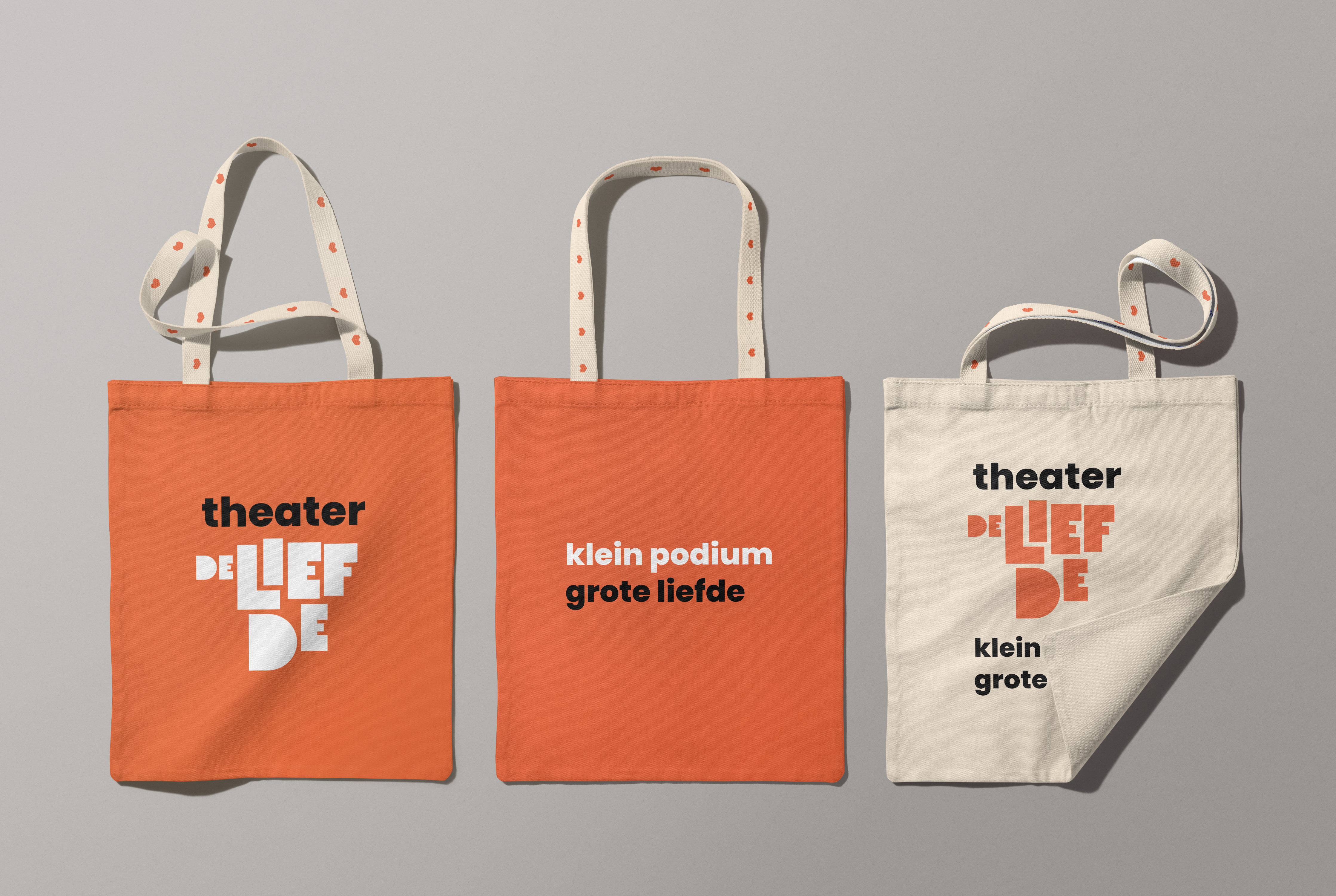
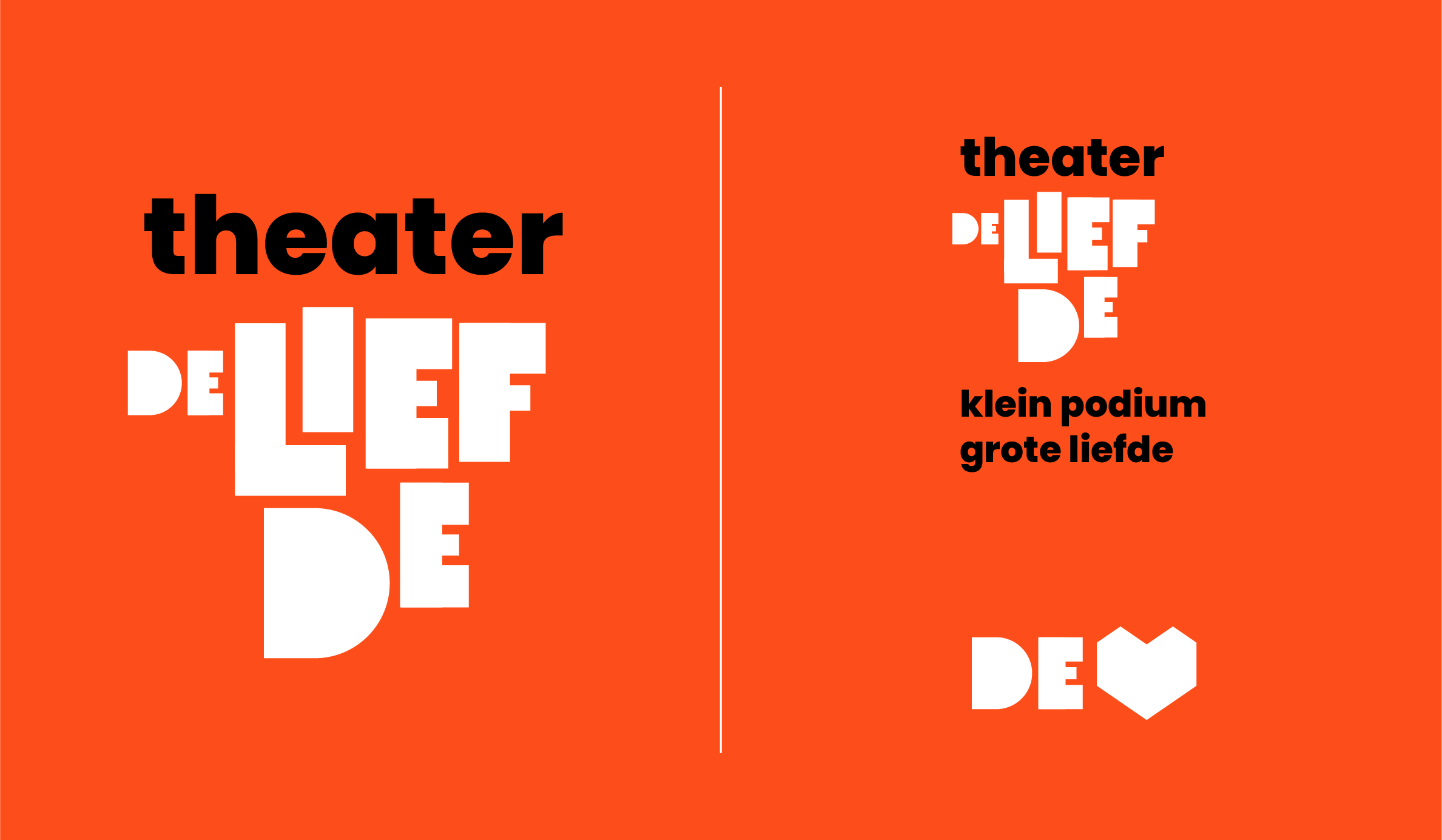
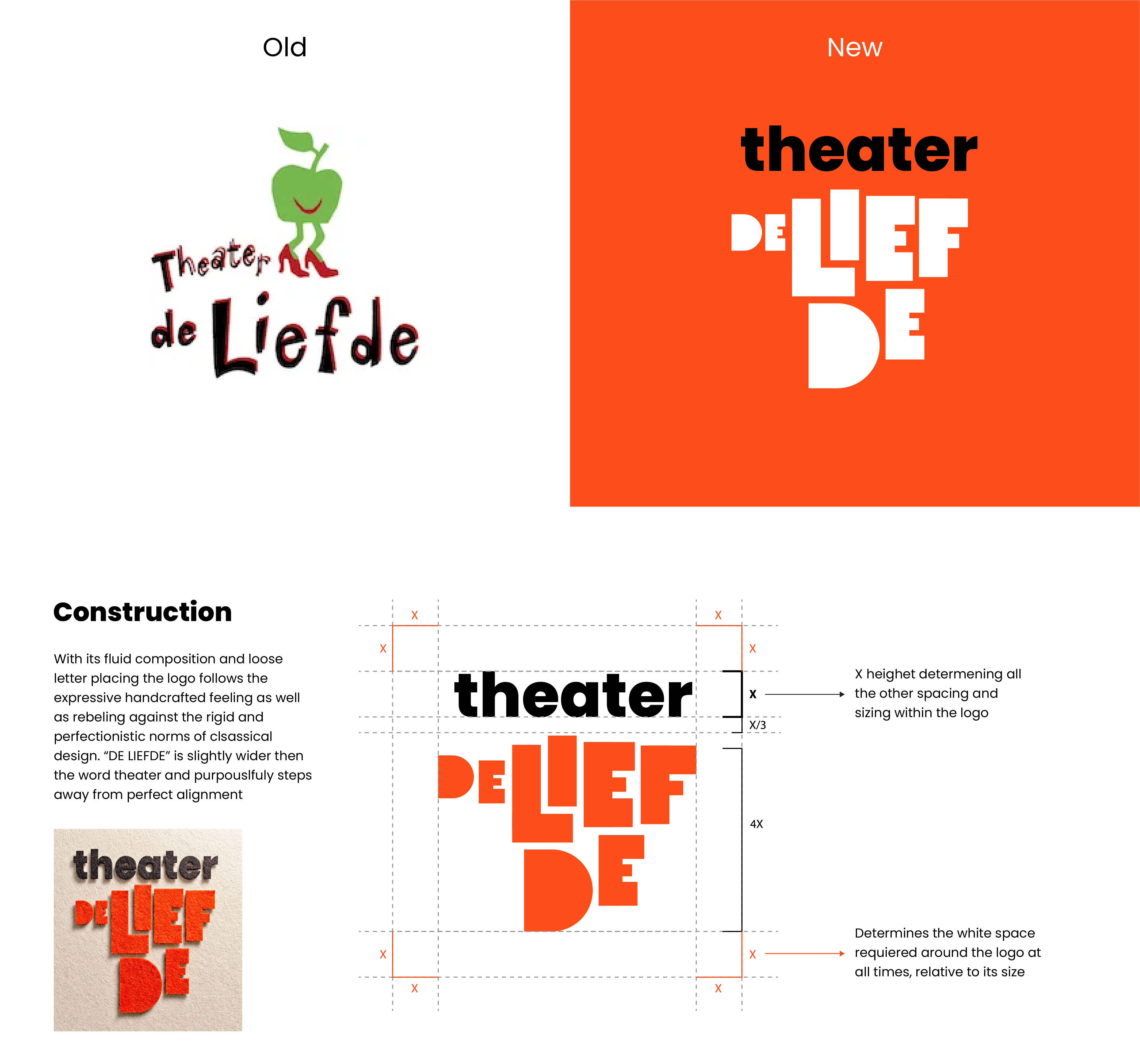
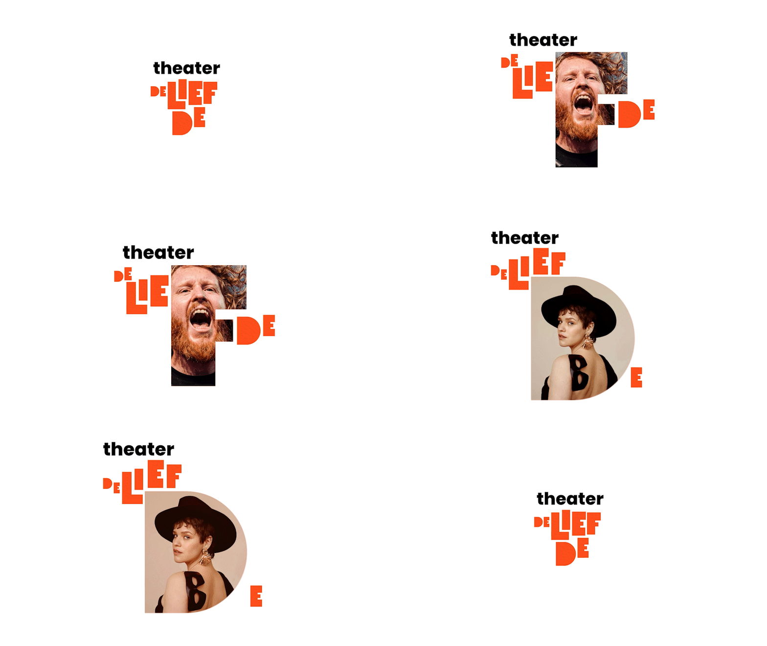
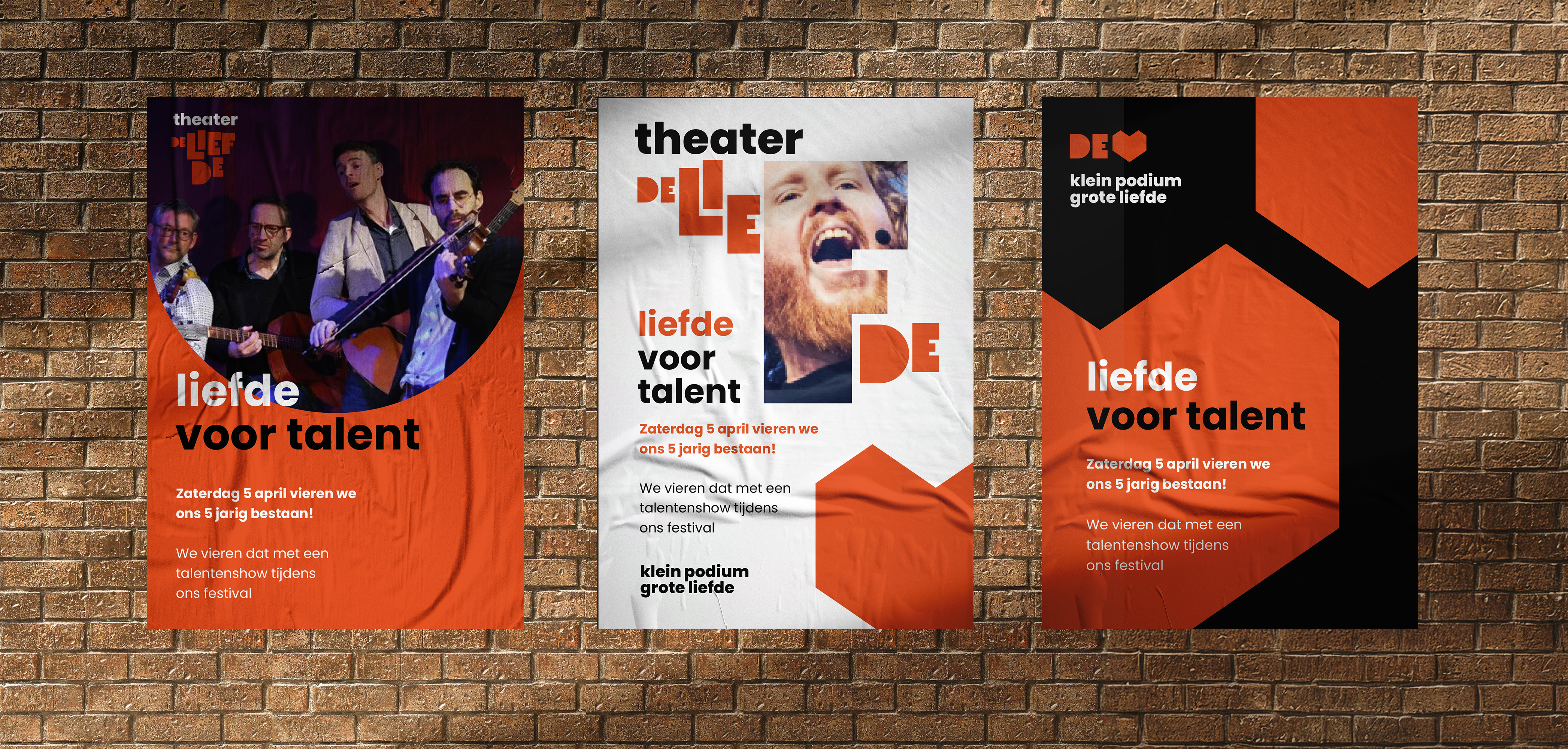
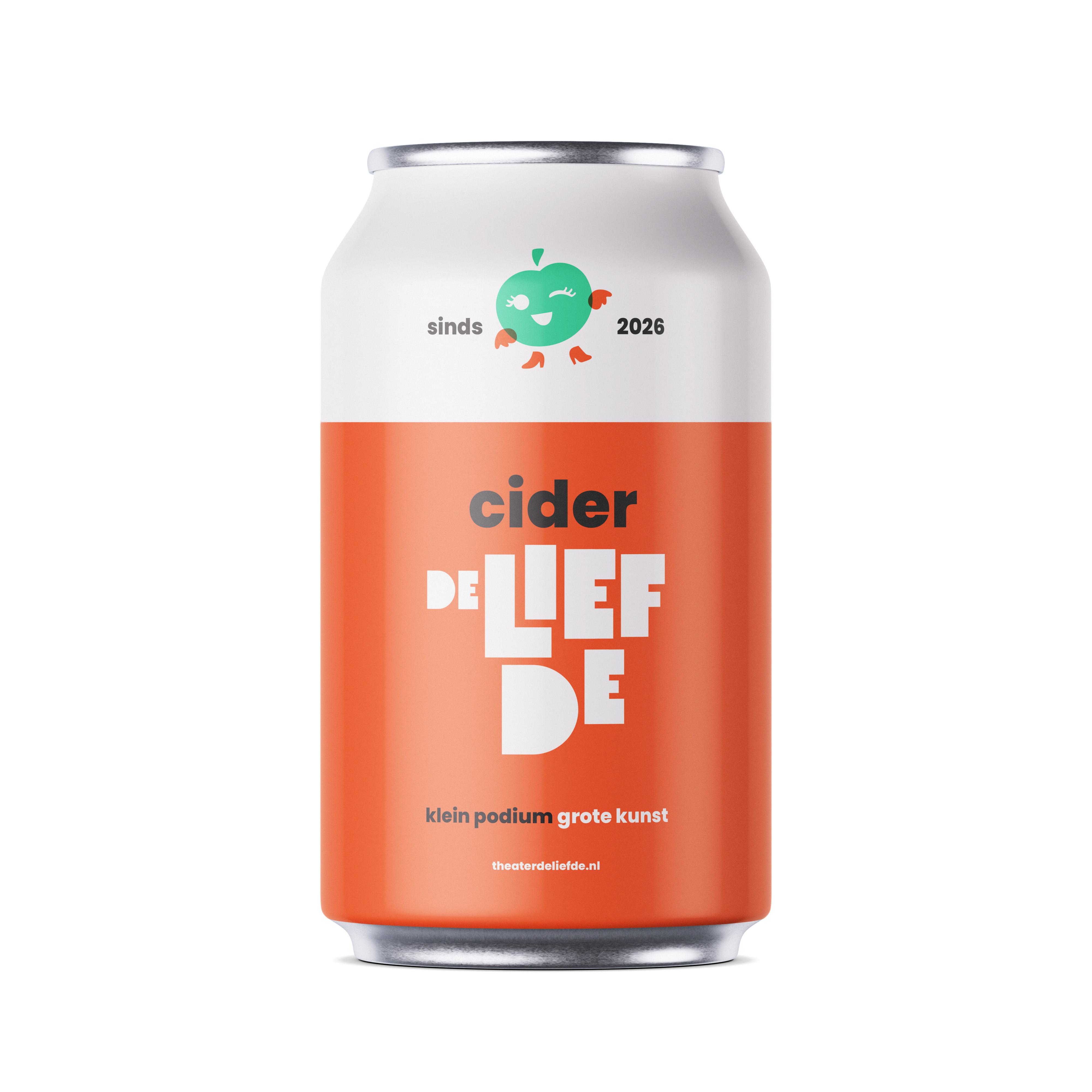
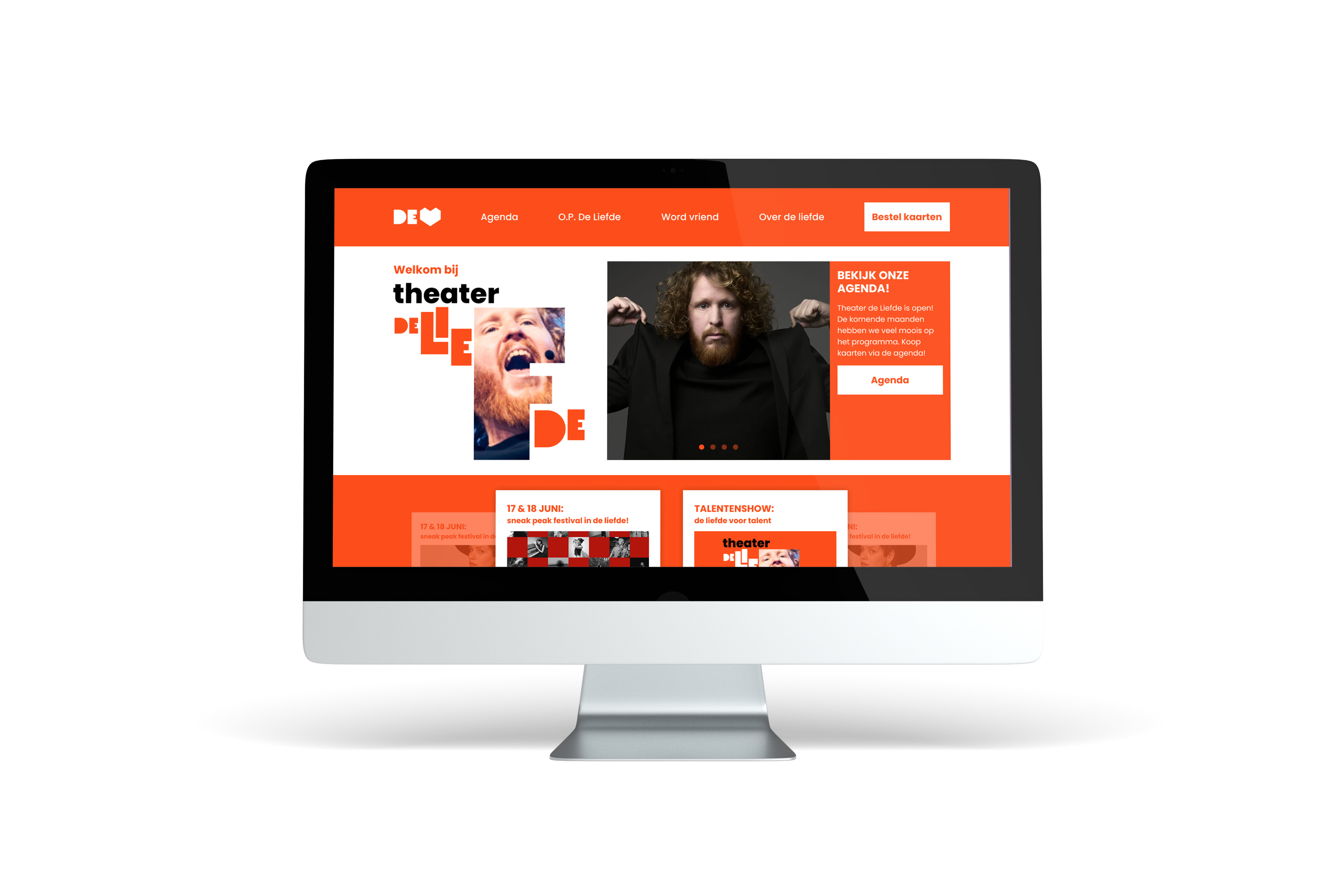
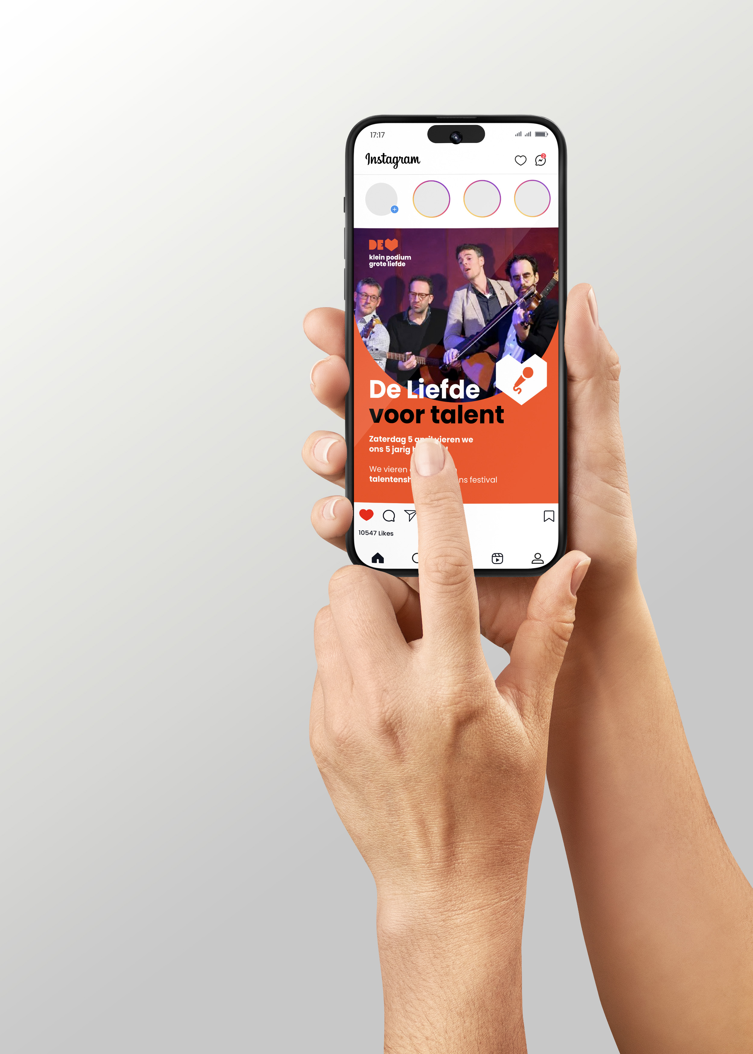
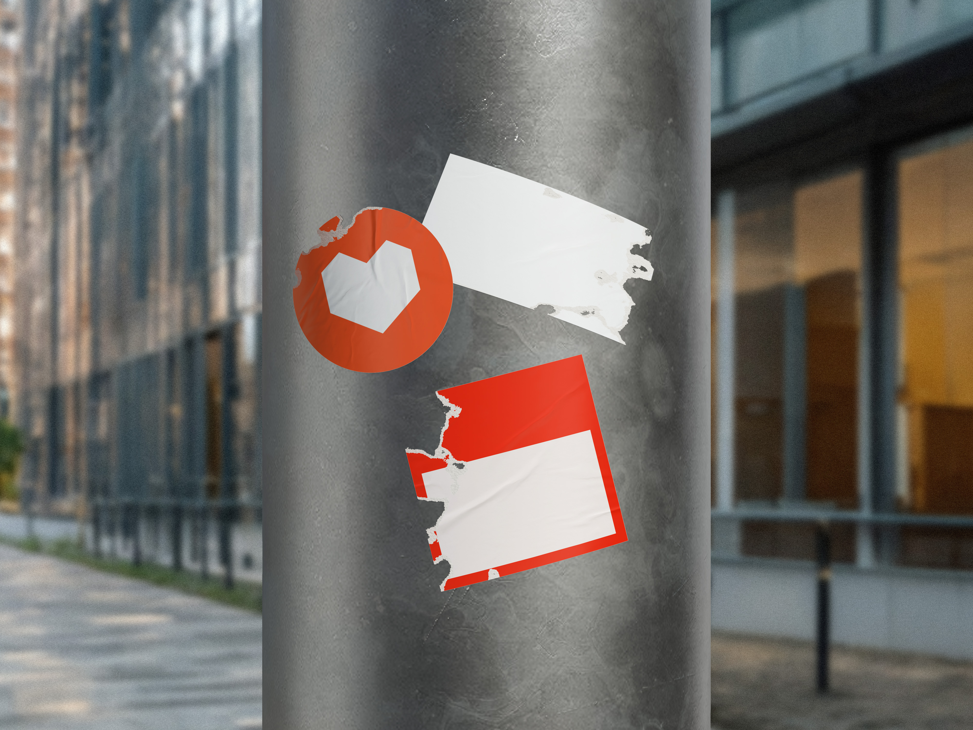
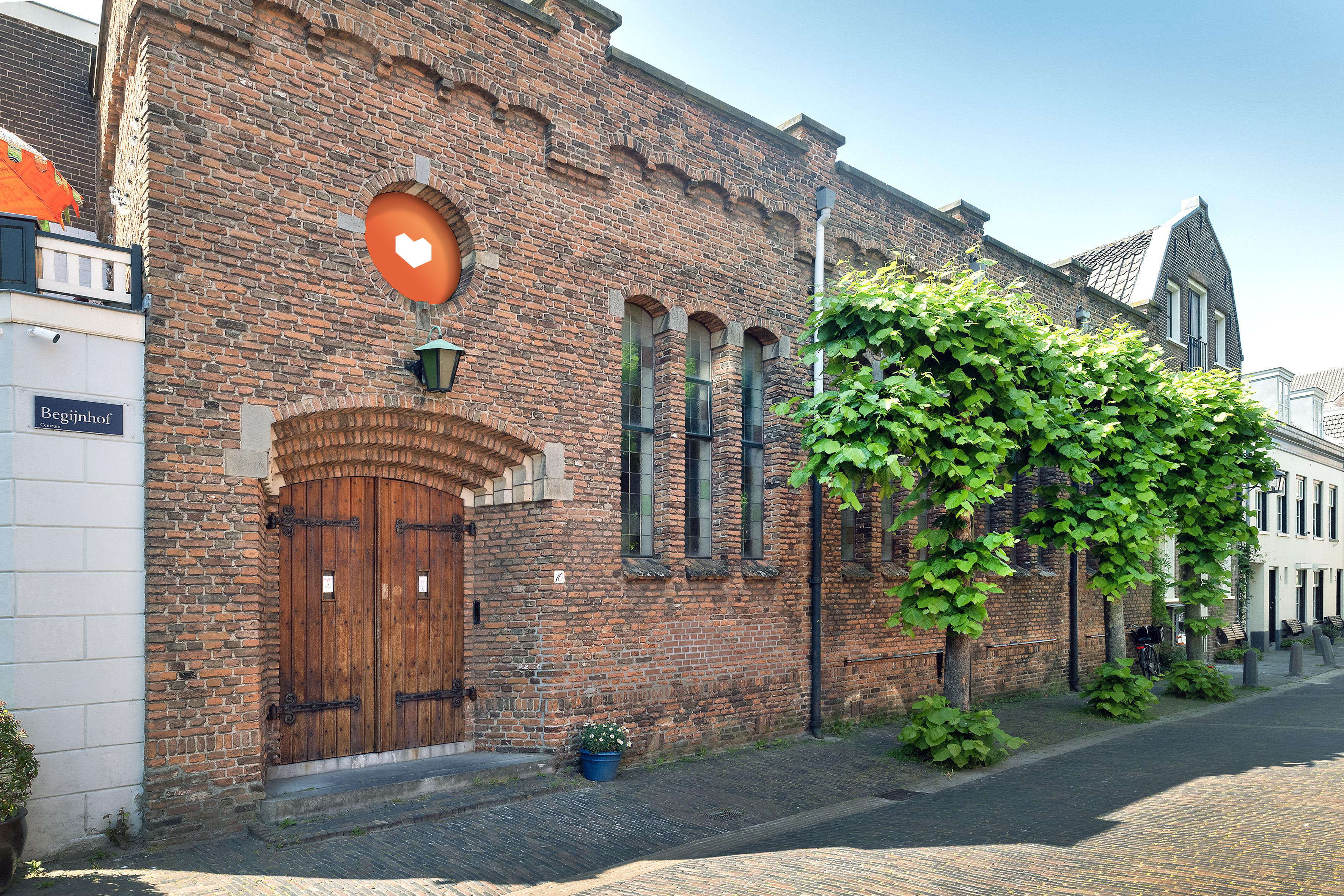
We wanted to create a branding that is versatile and adaptable, recognisable and iconic. Through the process we developed the slogan "klein podium, grote liefde" which means "small stage, big love" and emphasises the theatres intimate atmosphere and love for the performing arts.