Norgine Website Redesign

UX/UI design
client
Norgine
Project type
UX/UI design
PROGRAMMES USED
Figma Wordpress Adobe Illustrator Asobe Photoshop

Project description

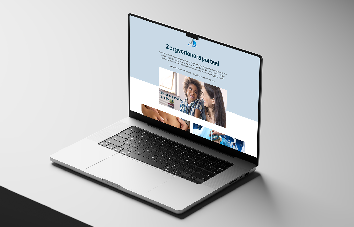
Norgine is a European specialty pharmaceutical company, headquartered in Amsterdam, with roots dating back to 1906. It has around 1,500 employees and roughly €650 million in annual sales, and it targets unmet medical needs from common conditions like constipation to rare and severe diseases such as childhood cancer. Its therapeutic focus spans hepatology, oncology, women's health and gastroenterology. Norgine's integrated model covers acquiring, developing and commercialising medicines, backed by in-house manufacturing in Wales and France.
Our thinking and Process

The Sitemap

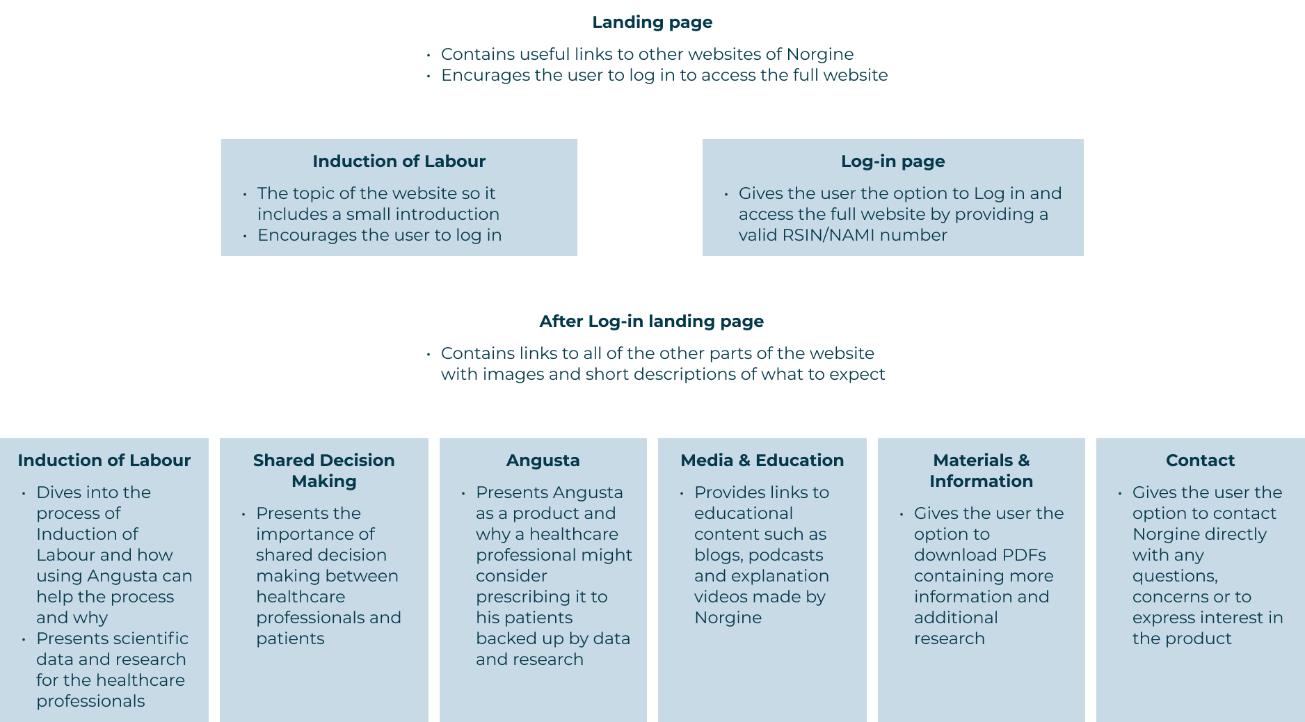
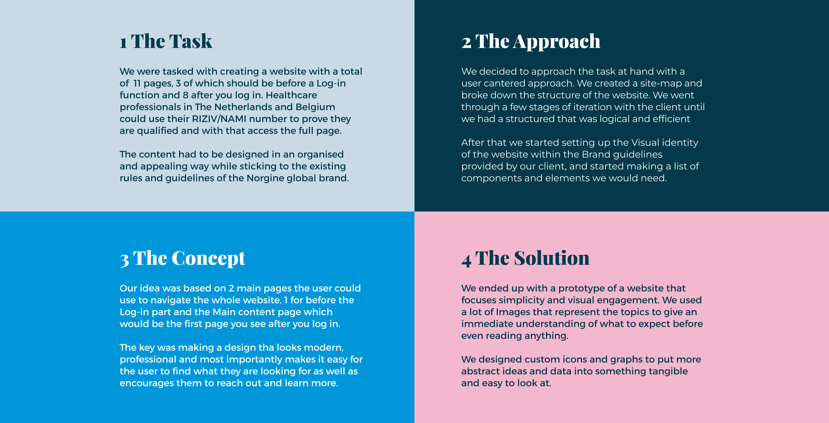
Before starting with any concrete design work we focused on creating an overview of the website. We laid out all of the pages that needed to be created, their main purpose and how they connect into the site as a whole. We had to understand how the log in function will work and divide the website logically. Our focus was also creating a website that has every page accessible as well as always keeping the log in and log out functions at hand so that the user can switch without much trouble.

Digital Brand Guide Setup

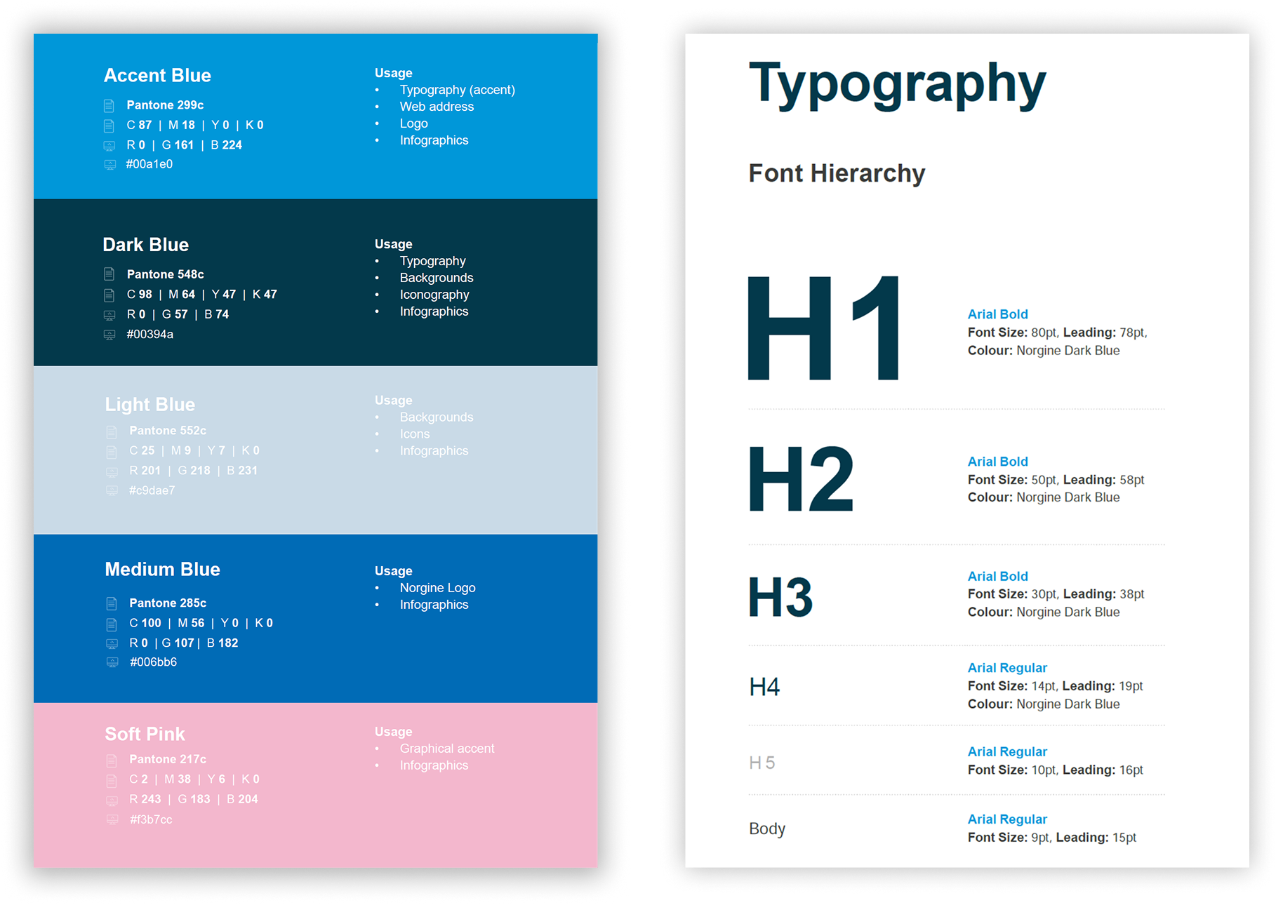
We set up a framework for the visual image of the website using the existing brand guidelines of our client. This Gave us a clear view of how the website will look visually and gives us rules to follow and design within upkeeping consistency and visual coherence on any of the pages. We created a Colour scheme from the clients Colours giving each colour a purpose for what it will be used for through the website in order to maintain consistency. We also set up a hierarchy of typography breaking it down into multiple title sizes and highlighted text to be able to use for any block of text on the website.
Custom iconography design
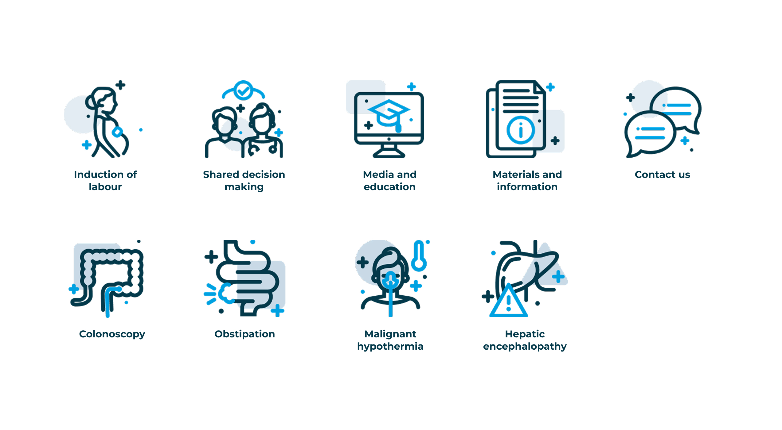
Our client wanted to have the content presented in a visual sense to reinforce their message and make it more appealing and easier to navigate. For this purpose we created a s custom set of icons to be used throughout the website. We knew we would be able to use the Icons as bigger image-like assets, which is why we created them in a more detailed and engaging way compared to the aim on simplicity when designing smaller navigation icons. We used a specific visual style that would immediately signal that these are specific to our clients website and would fit in seamlessly into the rest of the content.

No items found.

No items found.

No items found.

Other projects